Bratislava, February 26, 2026 – Bratislava University of Economics and Business (EUBA) is entering a new stage on the occasion of its 85th anniversary. It presents a new visual identity to the public, which dignifies the university's rich academic tradition and at the same time reflects its ambitions for the future.
The new visual style is not a change in itself. It is the result of a strategic process aimed at communicating more clearly and comprehensibly what EUBA is today – a modern university of economics with international accreditation, strong scientific authority and an emphasis on the employability of its graduates.
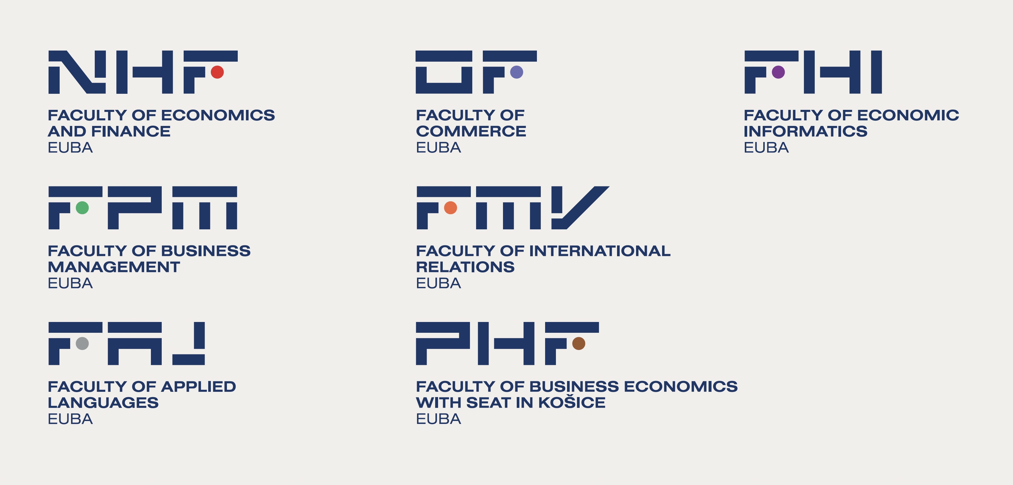
![]()
Same values, new character
"Our identity does not change. What changes is the way we communicate it externally. For 85 years, the Bratislava University of Economics and Business has been synonymous with professionalism, stability and responsibility towards the future of students. The new visual identity does not change these values - it makes them more understandable, legible and stronger in an environment in which universities today compete for trust," says the rector of the Bratislava University of Economics and Business, Prof. Ferdinand Daňo.
According to the rector, this is a natural step in the life of a modern university that adheres to its tradition, but at the same time realizes the need for clear and unified communication towards students, partners, and the public.
Symbolism of the new logo
The new EUBA logo is built on clear geometry and simple shapes that symbolize order, system and rational thinking – the basic pillars of economic education. A distinctive element is the circle, which represents the student as the center of the university environment and at the same time symbolizes the protection, continuity and cyclicality of education.
The author of the new visual identity, Mgr. art. Martin Knut, explains that the goal was not just to create an effective design, but also a functional and long-term sustainable system: "When designing, we based our design on the story of the university, its values, and the archetype of a wise caregiver. The identity should appear authoritative, but not cold – it should communicate certainty, care, and professional trust."
The identity color scheme is based on blue, traditionally associated with trust, professionalism, and the authority of knowledge. Complementary colors allow for the distinction of individual faculties and departments while maintaining a unified brand.
Gradual transition
"We want the EUBA brand to appear as confident and consistent on the outside as the quality of our education and research. The visual identity is therefore designed as a long-term and flexible system that will accompany the university in the coming years. The introduction of the new visual identity will take place gradually, with an emphasis on continuity and practicality. The new logo will appear on official communication channels, the website, social networks, presentation materials, as well as in the university premises," added Miroslav Horňák, Director of the Center for Communication and Public Relations and the person responsible for the implementation of the new visual identity.
A modern university for a successful future
EUBA is the only Slovak university in the field of economics and management education with the prestigious international accreditation AACSB. The new visual identity clearly communicates this position and supports the university's ambition to be one of the most trusted choices for economics education in Central Europe.
With this step, the Bratislava University of Economics and Business confirms its ambition to be a modern, trustworthy and internationally respected institution that combines academic wisdom with genuine care for the future of its students.
